POSTERS/OOO

EVANS CYCLES CHRISTMAS CAMPAIGN
I designed the Victorian inspired campaign lock-up to be used across all touch points for Christmas at Evans Cycles. Originally this campaign was designed for instore, but their marketing team liked the design so much they found the budget to book OOO sites, both 48 and 6 sheets. Plus I designed the digital OOO versions.


EVANS CHRISTMAS DIGITAL OOO
EVANS CYCLES TRADE-IN CAMPAIGN
For this campaign I had to use photography from the previous years’ camapign, but the new thought and strong typography brought a whole new feel to this press, poster and instore campaign.

SKY - INTERNAL EVENT
Sky organise a number of talks to cover various subjects. This was an event to give insight in to how the LGBTQ+ community were treated during the 1980's. I did a number of designs with an 80's theme.


EVANS CYCLES BIKE MATCHING CAMPAIGN
This campaign was all about matching the right bike to the right person - so I made the rider the focus


IHG
This campaign, covering OOO and LinkedIn posts was a recruitement drive for IHG’s Center of Excellence.


CAWSTON PRESS
The hand-made style of Cawston Press lent itself itself to a village fayre/parish notice approach to this press and poster campaign.


MAJESTIC WINE
My poster for Majestic Wine Calais highlighted the saving using coins in place of the cork.
It appeared on sites across the south east and was successful in driving foot fall across the channel.

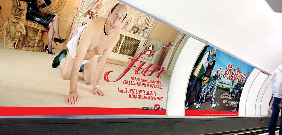
VIRGIN
My work on this campaign picked up a a Creative Circle silver for typography.
This campaign appeared in national press and cross-track posters.

WEST CORNWALL PASTY CO
Our agency picked up the WCPC based on our winning rebranding pitch.
My work gave them the warm, fun personality they wanted to keep but brought through stronger food values that their previous brand look and feel had lacked. I worked with the typeface designer to give us exactly what we what we wanted.
I also wrote a few of the headlines which was great fun.


CUERVO TEQUILA
A fun, cheeky campaign for Cuervo which was designed to look like home-made, naive flyers, so use mostly generic fonts and have a bit of fun.


A close up of the background
I used several textures then cut them up, sellotaped them together and scanned it in. I was trying to get some interest in different types of background without it getting too noisy.


CRAYSON
I designed a simple, elegant look for the campaign for a high-end property agent that went across OOO, press and digital.


NOTCUTTS GARDEN CENTRES
An instore campaign to encourage shoppers to plan ahead for spring flowering bulbs, that are planted in autumn. So bring colour and elegance through the photography and with the type I wanted to contrast that elegance with earthy gardening.


NOTCUTTS GARDEN CENTRES
An instore campaign I designed promoting the various festive activities across the garden centres.
